> ## Documentation Index
> Fetch the complete documentation index at: https://cometchat-22654f5b-docs-react-v7-feature-guides.mintlify.site/llms.txt
> Use this file to discover all available pages before exploring further.
# Plugins
> How the plugin system renders messages, the built-in plugins, and the AI plugin.
## What is a Plugin?
A plugin owns one or more message types. It tells the UI Kit:
* **How to render the message** as a bubble in the message list
* **What context menu options** to show when a user hovers/long-presses a message
* **What preview text** to display in the Conversations list subtitle
Every message that appears in the UI is rendered by a plugin. If no plugin matches a message type, the message is not displayed.
Plugins are a thin routing layer — they decide which bubble component renders a message and provide context menu options and conversation previews. The **bubble components themselves are standalone** and documented under [Message Bubbles](/ui-kit/react/components/message-bubble); this page links each plugin to its component instead of repeating that detail.
***
## Where Plugins Are Used
| Location | Plugin Method | What it does |
| ---------------------- | ------------------------------------------------ | ------------------------------------------------------------------------------------------------- |
| **Message List** | `renderBubble()` | Routes to the appropriate bubble component (e.g., `CometChatTextBubble`, `CometChatImagesBubble`) |
| **Message List** | `getOptions()` | Provides context menu items (reply, edit, delete, copy, react) |
| **Conversations List** | `getLastMessagePreview()` | Returns subtitle text ("📷 Photo", "You: Hello", "🎥 Video") |
| **Message Bubble** | `renderHeaderView()`, `renderFooterView()`, etc. | Customizes bubble regions beyond content |
***
## The Plugin Interface
Every plugin implements the `CometChatMessagePlugin` interface. Three members are **required**; everything else is optional and lets you override a specific bubble region or behavior.
| Member | Signature | Required | Purpose |
| ----------------------- | ------------------------------------------------ | -------- | ------------------------------------------------------------------------------------------ |
| `id` | `string` | Yes | Unique plugin identifier (e.g. `'text'`, `'polls'`) |
| `messageTypes` | `string[]` | Yes | SDK message types this plugin handles |
| `messageCategories` | `string[]` | Yes | SDK message categories this plugin handles |
| `renderBubble` | `(message, context) => ReactNode` | Yes | Render the inner bubble content (the outer wrapper is handled by `CometChatMessageBubble`) |
| `getOptions` | `(message, context) => CometChatMessageOption[]` | Optional | Context menu options for the message (return `[]` for none) |
| `getLastMessagePreview` | `(message, loggedInUser, t?) => string` | Optional | Plain-text subtitle shown in the Conversations list |
| `getTextFormatters` | `() => CometChatTextFormatter[]` | Optional | Text formatters this plugin provides (only the text plugin uses this) |
| `renderLeadingView` | `(message, context) => ReactNode` | Optional | Override the leading view (avatar area) |
| `renderHeaderView` | `(message, context) => ReactNode` | Optional | Override the header view (sender name area) |
| `renderFooterView` | `(message, context) => ReactNode` | Optional | Override the footer view (reactions area) |
| `renderBottomView` | `(message, context) => ReactNode` | Optional | Override the bottom view (moderation / error footer) |
| `renderStatusInfoView` | `(message, context) => ReactNode` | Optional | Override the status info (timestamp + receipts + "edited") |
| `renderReplyView` | `(message, context) => ReactNode` | Optional | Override the reply view (quoted-message preview) |
| `renderThreadView` | `(message, context) => ReactNode` | Optional | Override the thread view (reply-count indicator) |
For the view-slot methods (`render*View`), return a `ReactNode` to override the region, `null` to suppress it, or `undefined` to keep the built-in default. The full TypeScript interface and the `context` object reference are documented in [Creating a Custom Plugin](/ui-kit/react/plugins/custom-plugin).
***
## How Plugin Resolution Works
When the UI Kit needs to render a message, it asks the **Plugin Registry** to find the right plugin:
1. If the message is deleted (`getDeletedAt() !== null`), the Delete plugin handles it
2. Otherwise, the registry finds the first plugin whose `messageTypes` includes the message's type AND whose `messageCategories` includes the message's category
3. First match wins — plugin order matters
```
Message { type: "image", category: "message" }
→ Registry scans plugins in order
→ CometChatImagePlugin matches (messageTypes: ["image"], messageCategories: ["message"])
→ ImagePlugin.renderBubble() is called
```
***
## Adding Plugins
All default plugins are always included. To add your own custom plugins, pass them via the `plugins` prop on `CometChatProvider`. They are **prepended before** the defaults in the registry, so — because resolution is first-match — your custom plugin **takes precedence** over a default plugin that handles the same message type:
```tsx theme={null}
import { CometChatProvider } from "@cometchat/chat-uikit-react";
import { MyCustomPlugin } from "./plugins/MyCustomPlugin";
function App() {
return (
);
}
```
***
## Built-in Plugins
These plugins are included automatically — no code configuration needed to render their message type. Each routes its message type to a bubble component; follow the component link for the full rendering behavior, props, and CSS.
**Extension-backed plugins require a Dashboard extension.** The renderer for the four extension plugins — **Polls** (`extension_poll`), **Stickers** (`extension_sticker`), **Collaborative Document** (`extension_document`), and **Collaborative Whiteboard** (`extension_whiteboard`) — ships with the UI Kit, but the messages themselves are only produced once the matching extension is enabled in the [CometChat Dashboard](https://app.cometchat.com). Enable each one before the composer can send it or the bubble can appear: [Polls](/fundamentals/polls), [Stickers](/fundamentals/stickers), [Collaborative Document](/fundamentals/collaborative-document), [Collaborative Whiteboard](/fundamentals/collaborative-whiteboard).
| Plugin | Message type(s) | Category | What it renders | Component |
| -------------------------------------------------------------------------------------------- | ------------------------------------------- | --------- | --------------------------------------------------------------------------------- | ------------------------------------------------------------------------------------------- |
| **Text** | `text` | `message` | Formatted text with @mentions, clickable URLs, and markdown | [Text Bubble](/ui-kit/react/components/text-bubble) |
| **Image** | `image` | `message` | Responsive image grid with captions, batch grouping, and a fullscreen gallery | [Image Bubble](/ui-kit/react/components/image-bubble) |
| **Video** | `video` | `message` | Video grid with poster thumbnails, duration overlays, and a fullscreen viewer | [Video Bubble](/ui-kit/react/components/video-bubble) |
| **File** | `file` | `message` | Stacked file cards with type icons, size, and download | [File Bubble](/ui-kit/react/components/file-bubble) |
| **Audio** | `audio` | `message` | Attached audio as stacked player cards; recorded voice notes as a waveform player | [Audio Bubble](/ui-kit/react/components/audio-bubble) |
| **Polls** ([enable in Dashboard](/fundamentals/polls)) | `extension_poll` | `custom` | Interactive poll with voting and live results | [Poll Bubble](/ui-kit/react/components/poll-bubble) |
| **Stickers** ([enable in Dashboard](/fundamentals/stickers)) | `extension_sticker` | `custom` | Sticker image extracted from the message metadata | [Sticker Bubble](/ui-kit/react/components/sticker-bubble) |
| **Collaborative Document** ([enable in Dashboard](/fundamentals/collaborative-document)) | `extension_document` | `custom` | Document card with an "Open Document" button | [Collaborative Document Bubble](/ui-kit/react/components/collaborative-document-bubble) |
| **Collaborative Whiteboard** ([enable in Dashboard](/fundamentals/collaborative-whiteboard)) | `extension_whiteboard` | `custom` | Whiteboard card with an "Open Whiteboard" button | [Collaborative Whiteboard Bubble](/ui-kit/react/components/collaborative-whiteboard-bubble) |
| **Card** | any | `card` | Developer-defined card messages, drawn by the `CometChatCardView` renderer | [Card Bubble](/ui-kit/react/components/card-bubble) |
| **Group Action** | `groupMember` | `action` | Centered system messages (joined, left, kicked, banned, scope change) | [Group Action Bubble](/ui-kit/react/components/group-action-bubble) |
| **Call Action** | `audio` / `video` | `call` | Centered call status messages (missed, outgoing, incoming, ended) | [Call Action Bubble](/ui-kit/react/components/call-action-bubble) |
| **Meeting** | `meeting` | `custom` | Group/conference call invite card with a **Join** button | [Call Bubble](/ui-kit/react/components/call-bubble) |
| **AI** | `assistant`, `toolArguments`, `toolResults` | `agentic` | AI assistant responses, tool call arguments/results, and a streaming bubble | [AI Plugin ↓](#ai-plugin) |
| **Delete** | any (deleted) | any | "This message was deleted" placeholder | [Delete Bubble](/ui-kit/react/components/delete-bubble) |
***
## AI Plugin
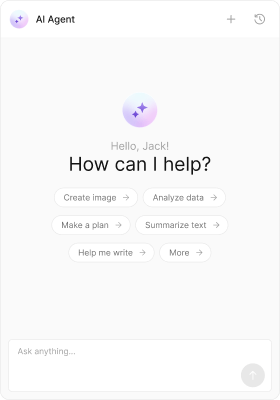
The AI plugin handles messages in the `agentic` category. It renders completed assistant responses (with markdown), tool call arguments and results (as formatted JSON), and a streaming bubble while the AI is generating. It is **included by default** — no installation or `plugins` configuration is required.
 ### Message Types
| Type | Category | What it renders |
| --------------- | --------- | ------------------------------------- |
| `assistant` | `agentic` | Completed AI response with markdown |
| `toolArguments` | `agentic` | Tool call arguments as formatted JSON |
| `toolResults` | `agentic` | Tool call results as formatted JSON |
Bubble components: `CometChatAIAssistantBubble`, `CometChatStreamMessageBubble`, `CometChatToolCallArgumentBubble`, `CometChatToolCallResultBubble`. AI messages are system-generated and have no context menu. For the full chat experience, see [AI Assistant Chat](/ui-kit/react/components/ai-assistant-chat).
### Conversation Preview
| Type | Preview text |
| --------------- | ------------------------------------------------------- |
| `assistant` | First 80 characters of the response (markdown stripped) |
| `toolArguments` | "Tool call" |
| `toolResults` | "Tool result" |
### Preloading
The AI Assistant Chat panel can be preloaded on hover/focus to reduce perceived latency:
```tsx theme={null}
import { preloadAIAssistantChat } from "@cometchat/chat-uikit-react";
// Call on AI button hover
onMouseEnter={() => preloadAIAssistantChat()}
```
### Message Types
| Type | Category | What it renders |
| --------------- | --------- | ------------------------------------- |
| `assistant` | `agentic` | Completed AI response with markdown |
| `toolArguments` | `agentic` | Tool call arguments as formatted JSON |
| `toolResults` | `agentic` | Tool call results as formatted JSON |
Bubble components: `CometChatAIAssistantBubble`, `CometChatStreamMessageBubble`, `CometChatToolCallArgumentBubble`, `CometChatToolCallResultBubble`. AI messages are system-generated and have no context menu. For the full chat experience, see [AI Assistant Chat](/ui-kit/react/components/ai-assistant-chat).
### Conversation Preview
| Type | Preview text |
| --------------- | ------------------------------------------------------- |
| `assistant` | First 80 characters of the response (markdown stripped) |
| `toolArguments` | "Tool call" |
| `toolResults` | "Tool result" |
### Preloading
The AI Assistant Chat panel can be preloaded on hover/focus to reduce perceived latency:
```tsx theme={null}
import { preloadAIAssistantChat } from "@cometchat/chat-uikit-react";
// Call on AI button hover
onMouseEnter={() => preloadAIAssistantChat()}
```